
Algorithmia uses Algorithmic Intelligence to colorise your photos
Web app of the day: Algorithmia’s auto-colorization service allows you to colorise black and white photos. The results are interesting with varying levels of success (see an example above). Colorful Image Colorization is an algorithm originally developed by Richard Zhang, Phillip Isola, Alexei A. Efros, which takes black and white pictures, and returns the image [Continue reading]

Prisma iOS app promises to add variety in your photo filters
I’m trying out the Prisma app that’s gone viral the last few days. Although we have had Photoshop filters that turn photos into “paintings” for more than two decades now, the creators of the app seem to have done a good job with their algorithms. The outputs (which the developers claim that are coming from [Continue reading]
Against motivation: 3 elements for success
There is no need to always search for motivation. Any goal will do the same job along with planning and monitoring. However, all three elements are required. Just setting a goal is not enough because it only takes a second to take the decision but there is nothing to trigger you to specific action after [Continue reading]

The Art of Letting Others Be Right
Lately, every time I get into an argument, and the distance of online communication can make this rather easy, I am reminded of an article by James Clear. Some key parts: I gather I have a long history of arguing my views, even when I’m not sure why I’m doing it. One time I was [Continue reading]

How to kill Facebook’s News Feed
Find yourself spending too much time on Facebook? Eradicate distractions by removing the news feed content. Chrome: News Feed Eradicator for Facebook Firefox: Kill FB Feed Safari: Quiest Facebook These solutions will allow you to still use messages and do posts of your own. To block Facebook (and other distracting sites) completely (or even better, [Continue reading]

Jukedeck: Royalty free music for your videos
Web app of the day: Jukedeck uses algorithms to create tunes (or even full songs if you allow a bit more flexibility on the definition of the word) based on a set of parameters of your choice (genre, “mood”, instruments, tempo and duration). The end result is a royalty free soundtrack that you can use [Continue reading]

Obama on how to achieve change
In a recent commencement address in Howard University, Barack Obama talked about his favourite topic: change. While he was talking about working to fix the issues that the US is currently facing, about the injustices that still exist, they can be viewed in a broader way. Excluding any discussion on his policies and implementations, here are [Continue reading]
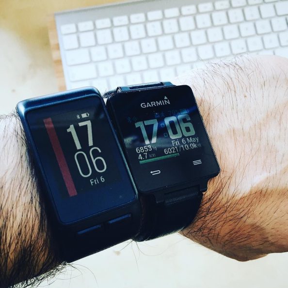
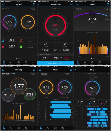
Vivoactive vs Vivoactive HR: First 3 days
So as of last Friday I’m the happy owner of a Garmin Vivoactive HR (will refer to it as VAHR, shown on the left on the photo above). Already owning the original Vivoactive (VA, shown on the right of the photo) model, here are some impressions between the two. This isn’t meant to be a [Continue reading]

Focus is about saying no
Steve Jobs was asked (WWDC’97) about some of Apple’s choice at the time in cutting off features, and had this to say: “People think focus means saying yes to the thing you’ve got to focus on. But that’s not what it means at all. It means saying no to the hundred other good ideas that [Continue reading]
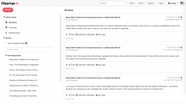
How to export and manage all your Kindle highlights
Web app of the day: Clippings.io (free) is a handy service allowing you to export/backup and manage your highlighted texts from your Kindle device. You can: – Browse your Kindle highlights online – Import your Kindle highlights from any device – Edit and annotate your Kindle highlights and notes – Search your Kindle highlights online [Continue reading]
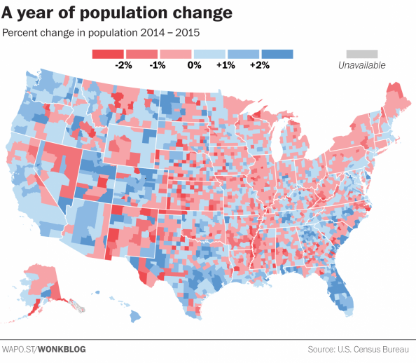
Choose your colours and thresholds wisely
When creating a visualisation of data, the colour choices and classes that your assigned too can change the message you’re trying to present. In a world of fast moving readers and quick social media sharing, all that can be left from your data analysis will be a visualisation that might give the wrong message. Read [Continue reading]
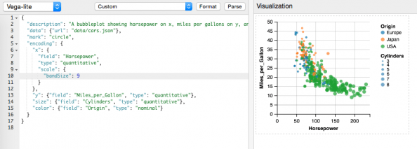
Vega-Lite: producing complex visualisations with minimal amount of code
Here is an interesting visualisation library released just a few days ago from the University Washington Interactive Data Lab. Vega-Lite is a high-level visualization grammar. It provides a concise JSON syntax for supporting rapid generation of visualizations to support analysis. Vega-Lite can serve as a declarative format for describing and creating data visualizations. Vega-Lite specifications [Continue reading]

Adobe Post: Easily create social media/blog graphics on your iPhone
Adobe continues its release of free/freemium mobile apps. Adobe Post makes it easy for anyone to turn their photos and text into “beautifully designed graphics,” the company says, then share them on social networks like Twitter, Facebook, Instagram, and Pinterest. The app is easy to use, allowing you to select a single image from your [Continue reading]
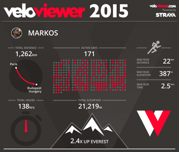
Your free 2015 fitness infographic
If you’re a Strava user, VeloViewer will create a visual overview of your running and/or cycling. VeloViewer seems like an interesting service: VeloViewer Tour Notes (Restricted to 25 activities for free users. Upgrade to PRO to see your entire Strava history.) Your Activities page provides a fully filterable and sortable list of everything you’ve uploaded to Strava. [Continue reading]
Don’t forget to be happy!
Happiness makes people more productive at work, according to the latest research from the University of Warwick. Economists carried out a number of experiments to test the idea that happy employees work harder. In the laboratory, they found happiness made people around 12% more productive. […] During the experiments a number of the participants were [Continue reading]

Year in review, 2015: Sony Pictures
It’s the time for yearly reviews and resolutions. In 2015 I was mostly shooting with my iPhone, with the Sony NEX-5R being used during vacations. Still, even most of them are still waiting to be processed. Anyway, here are are a small selection of photos from the last year. So, how was your 2015 in [Continue reading]

Journalists are slamming into scientific studies, exposing a key flaw in media
I was writing a few days ago about science reporting in media. Well here’s a bit more on this. Just as Robert Scoble was writing yesterday about the issue of “techno skeptics” and the role of media (bottom line: fear sells more paper/pageviews. Full read here) I bump into a highly sensationalised headline on Bloomberg [Continue reading]

Resistance is how we protect ourselves from taking risks
“This is going to kill your children” – Jamie Oliver is making a point about cooking junk food for your kids. The quote and screenshot above is from Jamie Oliver’s Food Revolution. What I find interesting in the show is not so much the garbage that we eat these days, as much as the amazing amount [Continue reading]

What You Believe Affects What You Achieve
Our genes influence our intelligence and talents, but these qualities are not fixed at birth. If you mistakenly believe that your capabilities derive from DNA and destiny, rather than practice and perseverance, then you operate with what Dweck calls a “fixed mindset” rather than a “growth mindset.” Our parents and teachers exert a big influence [Continue reading]

Tired? Think again
Science says your mind gives up before your body. Marcora believes that this limit is probably never truly reached—that fatigue is simply a balance between effort and motivation, and that the decision to stop is a conscious choice rather than a mechanical failure. This, he says, is why factors that alter a person’s perception or [Continue reading]
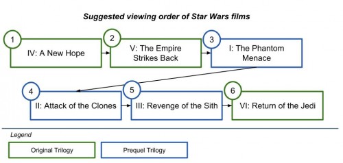
Thank you Internet: the best order of watching Star Wars
1 part crowd-sourced Q&A (the sci-fi StackExchange site) and 1 part Google’s Knowledge Graph (a database of answers and indexed data based on semantic search concepts) to get an instant result on my critical search: “correct order of watching Star Wars” In case you wonder, here’s what the Internet has decided for my life in [Continue reading]
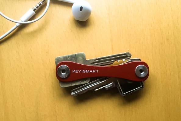
The 100-word KeySmart review
On of my favorite purchases of the last couple of years has a CyberMonday offer, so I’ve finally decided to post about it. The premise is simple: KeySmart will hold your keys in a tight, small place. And yes, these are my keys in the photo :) I got it so that I no longer [Continue reading]
Learning from failure
Currently reading: When we do experience failure, we need to approach what has gone wrong in a realistic way too. If we don’t examine the reasons why we have failed or are failing then we may find ourselves condemned to make the same mistakes over and over again. Even worse is refusing to admit that [Continue reading]

What is it with Dutch sites and terrible cookie consent pop-ups?
This just happened in two Dutch sites in a row. Now, the need to conform with law is one thing. However, blocking access to content, and refreshing the entire page after the user consents (e.g. more time delay), is extremely user hostile. Let’s be clear. If even showing a glimpse of your content has as [Continue reading]

Where has my desktop Google+ gone?
Some first-day gripes on the new #GooglePlus #UI. In short, it seems like the mobile UI has eaten up the desktop one. Here goes (also sending these over the @Google+ feedback form): Everything needs a click. No more hovering. While that make sense in mobile, I don’t see why the desktop experience must suffer. Hover [Continue reading]

Google’s Boolean Logic Doodle: what does it mean?
If you were stuck on Google’s homepage today trying to understand what the doodle is about, here’s the meaning of each combination. In each case, the “x” and “y” circles of the lowercase “g” letter are hidden or shown according to the highlighted operation as if you were do a search on two terms (“x” [Continue reading]

Links in e-mails: Always hover before you click
In the screenshot, a fresh #phishing (received three times already today) attempt masquerading as a message from #Paypal . The subject was “We’ve limited access to your PayPaI account” Luckily, OSX Mail (most mail software do this, Outlook as well) shows you the address of any link when you hover over it. More on phishing [Continue reading]
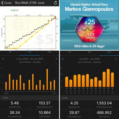
New Garmin Connect app brings updated interface and more stats
Garmin (probably the best choice for sports gadgets) has completed a full redesign of its Garmin Connect mobile app. The updated app, which is now available to download for Android and iOS, has a completely different look from its predecessor, which largely mimicked the desktop version of Garmin Connect, with individual home screens for different [Continue reading]
Medium is a mess
Apparently, +Medium’s smart algorithms on what I should be reading next suggest that I should read my own posts. Seriously? In the screenshot, you can also witness the fresh Responses idiocy, which are supposed to be full-blown, long-text articles, but everybody (myself included) is using as an old-school comments form, disregarding the initial, actually-well-thought, feature [Continue reading]

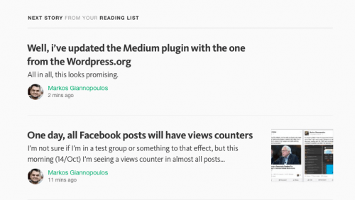
One day, all Facebook posts will have views counters
(Update 22/Oct: Facebook now says this was a bug, no intention of actually showing views to regular people.) (Update 15/Oct: Aaaaaaand, it’s gone. No more views counts :) Let’s see how many years this takes to be fully implemented. If at all.) I’m not sure if I’m in a test group or something to that [Continue reading]