HOME / Design
Font-pairing with Google Docs
Discovery of the day, filed under “Most Probably People Know About This For Years Now”. One of the first parts of any design project is settling down on the fonts that will be used. Usually this comes down to selecting a font for headlines and one for body text. Choosing a third font is for [Continue reading]
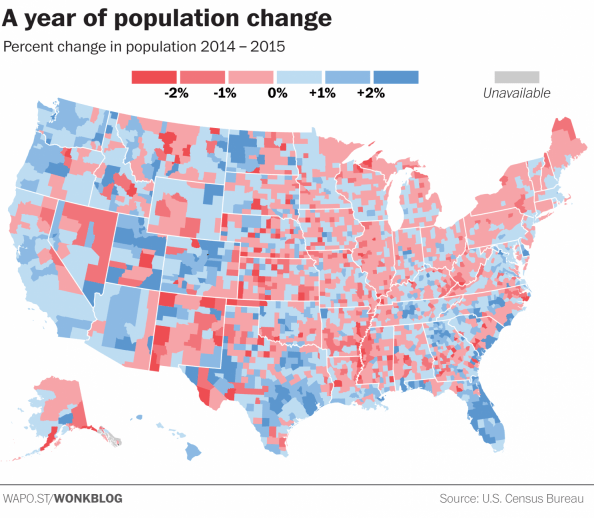
Choose your colours and thresholds wisely
When creating a visualisation of data, the colour choices and classes that your assigned too can change the message you’re trying to present. In a world of fast moving readers and quick social media sharing, all that can be left from your data analysis will be a visualisation that might give the wrong message. Read [Continue reading]
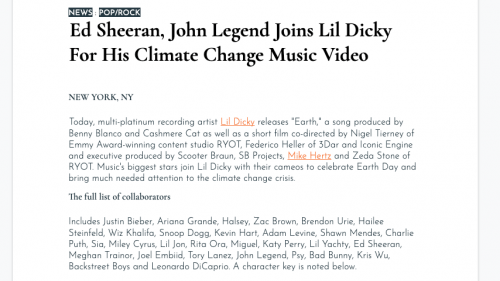
Adobe Post: Easily create social media/blog graphics on your iPhone
Adobe continues its release of free/freemium mobile apps. Adobe Post makes it easy for anyone to turn their photos and text into “beautifully designed graphics,” the company says, then share them on social networks like Twitter, Facebook, Instagram, and Pinterest. The app is easy to use, allowing you to select a single image from your [Continue reading]
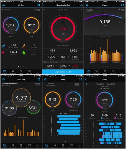
New Garmin Connect app brings updated interface and more stats
Garmin (probably the best choice for sports gadgets) has completed a full redesign of its Garmin Connect mobile app. The updated app, which is now available to download for Android and iOS, has a completely different look from its predecessor, which largely mimicked the desktop version of Garmin Connect, with individual home screens for different [Continue reading]
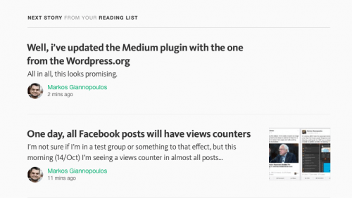
Medium is a mess
Apparently, +Medium’s smart algorithms on what I should be reading next suggest that I should read my own posts. Seriously? In the screenshot, you can also witness the fresh Responses idiocy, which are supposed to be full-blown, long-text articles, but everybody (myself included) is using as an old-school comments form, disregarding the initial, actually-well-thought, feature [Continue reading]
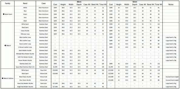
All the specifications of the Apple Watch in one spreadsheet
If you’re looking for exact specifications in Apple’s site for the Apple Watch, you’re in bad luck if you also want to compare the actual numbers of the various versions and bands. Apple is giving specs on each combination only, which means you have to go through page-by-page to make comparisons. Rob Griffiths did the [Continue reading]
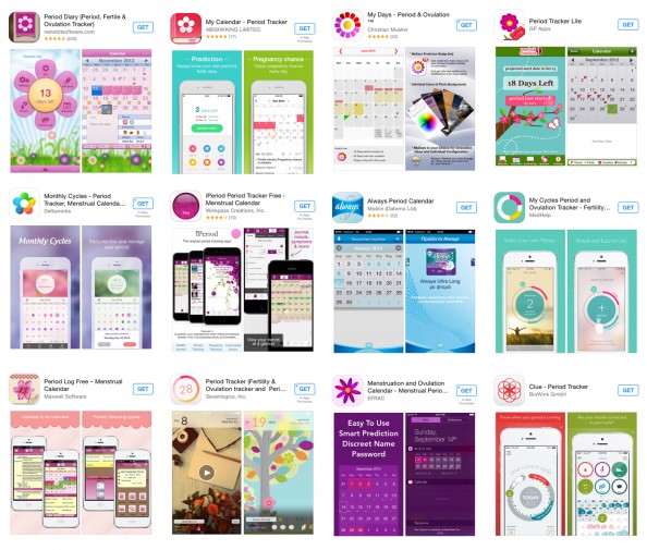
The war on women: feminist tech journalism
As an avid user of self-tracking apps, the Atlantic’s title caught my click: “How Self-Tracking Apps Exclude Women“. I go on to read about how men at Apple HQ designed an app that ignores menstruation: How could Apple release a health-tracking app without the ability to monitor what is likely one of the earliest types [Continue reading]
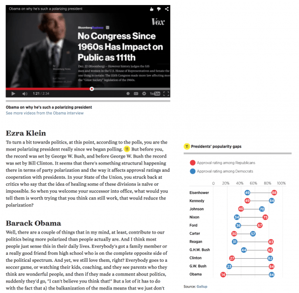
VOX: Editorial design for a digital world
Here is a great example from VOX on what it’s like doing an interview for a digital world, in a way that no other medium can achieve. The basic idea? The full text of the interview is accompanied by charts, links and annotations providing more depth on the answers. But that’s just the half of [Continue reading]
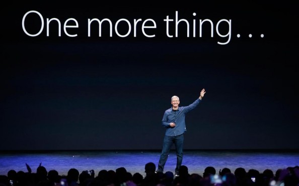
Report from the reality distortion field
(As Apple announced it’s record quarterly net profit [7] of $18 billion this week, I’m re-posting/translating an article I wrote for the leading Greek newspaper Kathimerini [8], back in September 2014, after the Apple Watch announcement). This week saw the announcement of the new generation of iPhone models, as well as the most expected Apple [Continue reading]
Is the new colour of your company taken?
Is the amazing colour you just picked for your new company close to something already used by a big company? See an extensive list of “taken” colours at brandcolors.net (collected by Galen Gidman) h/t +Nassos K.
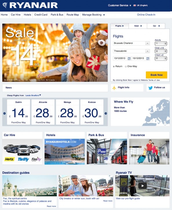
It’s the end of an era for web design
Ryanair has redesigned it’s website. Before it looked like it was designed in 1992 (because it probably was). Now it looks like someone paid 15$ for a template. But even that is an improvement. You don’t have to prove you are a human in order to get a ticket for starters. I guess the lousy [Continue reading]
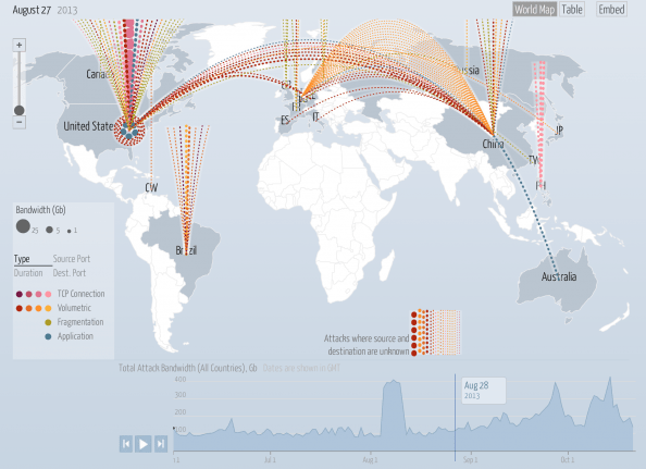
Data visualisation porn
The Digital Attack Map is a live data visualization, built through a collaboration between Arbor Networks and Google Ideas, that maps “distributed denial of service” (DDoS attacks) designed to take down websites around the globe. Many websites face targeted digital attacks by people who aim to silence their speech. This tool and visualization specifically surfaces [Continue reading]
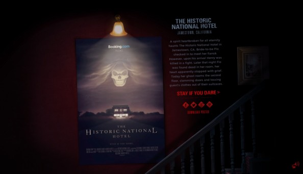
Parallax for the right reasons
I’m not a big fan of parallax web sites, mainly because it’s being overused without much point and it is usually not well implemented, resulting in slow-loading websites. Once in a while though, you get a website where the parallax effect is actually part of the concept of the website. Booking.com has an excellent new [Continue reading]
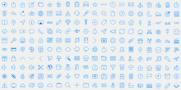
Glyphish icon set for iOS7
Like it or not, the iOS7 style is here to stay and will most likely affect not just mobile apps but also web apps. So, if you’re looking to stay current with Apple’s style, Glyphish has a new set with 200 thin-styled icons following the iOS guidelines. Check them out at www.glyphish.com (cost: $25)
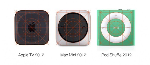
iOS grid design coming from the past
The grid used in the #design of the iOS7 icons is apparently not something new for Jony Ive. Here’s a look at three different-sized hardware designs that also used the same grid almost perfectly! Source
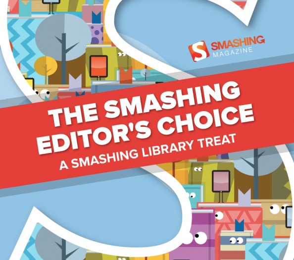
Free eBook for web designers
// Smashing Magazine is promoting it’s Smashing Library service and they are offering a free eBook with a collection of some of their best articles. Contents include: – Designing For The Reading Experience – Logical Breakpoints For Your Responsive Design – Sketching A New Mobile Web – Towards A Retina Web – Avoiding The Pitfalls Of [Continue reading]
Jazz up your web page with Spritely
// Apparently, programming, like life, is sometimes going in circles. Almost 30 years ago I was doing my first steps in programming, coding sprites on my MSX2 in some lame attempts at game development :) Today, I’m revisiting the technique for a whole different purpose. Below you can see an elegant approach to a hover [Continue reading]
Blog Redesign, Part II
// I’ve been refining the redesign of this blog (see previous post about it for a screenshot of how it looked in the past) and here is the summary of recent changes: All pages: Full page width! Home page: – More space between boxes – Very very white background on boxes instead of gray – [Continue reading]

Look, I have a notification about… something
// The badge icon says I have a notification in the #Google+ app. So I open it, and click app’s notifications counter. And I see this. Some (specified) people did something but it doesn’t tell me what. Some other people whose names are mentioned did something else (or perhaps the same action) in probably another [Continue reading]

Now this IS parallax!
// I’m not a big fan of parallax scrolling sites. Mainly because it is CPU-intensive which means that you will have people with a bad experience and by definition you are constrained to a small number of "pages" which means that you can only use it for small sites and you can’t upgrade such a [Continue reading]

Blog redesigned – comments?
// I hadn’t touched my blog’s design for a bit over year, so I thought it was time for a refresh. Yes, In case you haven’t noticed, I have a blog at which contains a full (an indexed) archive of all my Google+ posts. So over the last 20 months I have ended up writing [Continue reading]

Finally, an awesome UX tutorial
// Answering the question "What are the best resources for learning bleeding-edge web, UI and UX design?" on Quora, Colm Tuite, UI/Visual Designer & Developer, decided to write one of this own. The result was an extensive post / #tutorial with 10 steps to a decent (if not great) start in learning about #UX. To sum [Continue reading]

Colours, Emotions, Brands
// This kind of chart has been going around the net for a while, but a reminder is always good :) If you’re looking for more #marketing -oriented #color #infographics see also How do colors affect purchases?http://bit.ly/VG6O70 (Chart by The Logo Company http://bit.ly/VG6wwT)

The interface is (part of) your brand
// When it’s pointed out it is kind of obvious but you might not consider it otherwise. Interface elements are indeed part of your brand. If you’re not convinced take this quiz: can you recognise the origin of the buttons on the image below? Answers on the original article by +Marc Hemeon : http://bit.ly/11cxFK9 Marc has [Continue reading]

15 Years of Apple.com
// A collection of #Apple ’s home page layouts since 1997!http://www.slideshare.net/choehn/15-years-of-applecom-15990876

Reminder: People come to your site to consume content
// They do not come to see ads or others links to other pages to your site, or navigation links or social media buttons. So it is a bit counter-productive if the first 800 (probably more) pixels of your page do not have a single line of text from your content. The example below is [Continue reading]

Icons in a Font: Elusive & Font Awesome
// Elusive and Font Awesome are two open-source #fonts containing over 200 icons each. They are geared to be used with Twitter Bootstrap but you can use them in any kind of project. Check them out!Elusive: http://bit.ly/VCtQ9BFont Awesome: http://bit.ly/WatPZ5If you need more #free choices, here some more in font and PNG formats: http://bit.ly/UKIqxA

A Laconic History of the World
// Simplifying history is of course… simplistic, but still here’s a #fun #typographic #map designed by Martin Elmer of maphugger.com This map was produced by running all the various countries’ “History of …” Wikipedia article through a word cloud, then writing out the most common word to fit into the country’s boundary. The [Continue reading]

The Subtle Art of Documentation Advertising
The screenshot below is from a case study article of Microsoft’s MSDN developer site. In a great example of how to advertise #Metro over iOS without shouting "Metro kicks ass!", the article describes all the steps the authors/developers took to convert an iPad app to Metro. At the same time, every single part of the [Continue reading]

Download: Windows Metro Icon Collection
Here is http://bit.ly/PI0JkX a collection of 690 #icons in the visual style of #Windows 8 (also known as #Metro ). The collection comes with – Separate PNG files 26×26 pixels for each icon, ready to use– Single EPS source file so you can scale the icons in any vector image editorMany thanks to the kind people of [Continue reading]